THE City of Casey’s new website is designed to improve accessibility, allow faster access to current news, and be more visually appealing than its predecessor.
For the most part, the website ticks all the relevant boxes.
Current news and upcoming events take centre stage on the home page, and every page is available in a printer-friendly format, meaning home users can print hard copies without using excessive ink.
The ability to view pages in a format suitable for handheld devices such as PDAs and mobile phones is a useful feature well ahead of current website standards.
A visually strong black and navy blue colour scheme has replaced the white colours of the old Casey page, and the new home page layout is effective in directing users’ attention to information on current issues.
But perhaps the most useful feature is the integration of Google maps into the community directory. Not only will visitors be able to retrieve the address and contact details of the community facility, but the ability to view a map of the location is only one click away.
A search for ‘Akoonah Park, Berwick’ quickly returned with a Google map and the option to view driving directions from another location.
Criticisms of the new site are hard to find, but a problem with the old site has wormed its way into the new setup. There are still too many drop-down options on the main navigation menu across the top of the page. Hover on the ‘Business’ menu and 23 drop-down options appear, select the ‘Business Directories’ tab and another six options present, forcing the menu off the screen.
The website also claims to display images showing the ‘spirit’ of Casey, and while a number of pictures certainly achieve this, the once colourful City of Casey logo is only displayed in black and white in the top-left of screen.
Overall, the new City of Casey website is a revolution in ease-of-use, and strongly reflects the 12 months of development and testing invested in it.
Check out Casey’s new website at www.casey.vic.gov.au
Casey’s web of intrigue
Digital Editions
-
Soil clean-up wait continues
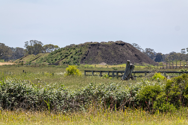
Purchase this photo from Pic Store: 522112 A giant asbestos-riddled soil mound in Bangholme’s Green Wedge still remains, despite an order for its removal by…

